IIBA 2022 Impressive Individual Award
Dec 29, 2022
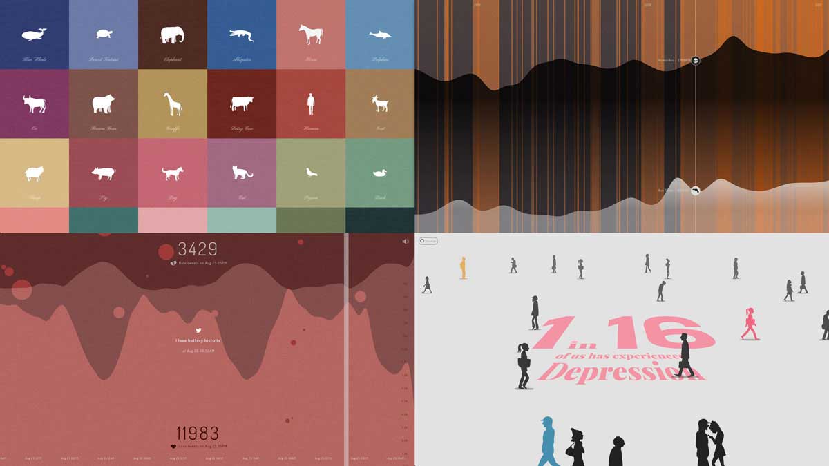
PatternBased artist Siori Kitajima has received the Information Is Beautiful Award 2022, the special 'Impressive Individual' award, with her 4 original data visualization works 'Heartbeat.', 'Information and Violence', and more. The award was announced at the Data Visualization Society's ceremony held in Washington DC, USA, on Nov 30, 2022.
The judging panel commented on the reason for winning the special prize: 'Both of Ms. Kitajima's shortlisted works were magnificent. She finds inspiration in thinking about and untangling complex topics and uses data and statistics to inform her work.'
Kitajima said, 'I am truly honored to receive this award and this will be a great encouragement to my future productions. In order to understand the complex world and to explore various social problems and solutions, Data Viz is a wonderful form of art, and I would like to continue to help tell various stories using data with even higher motivation.'
Below is the list of four pieces submitted to the IIBA 2022. Click the links to enjoy.
Heartbeats.
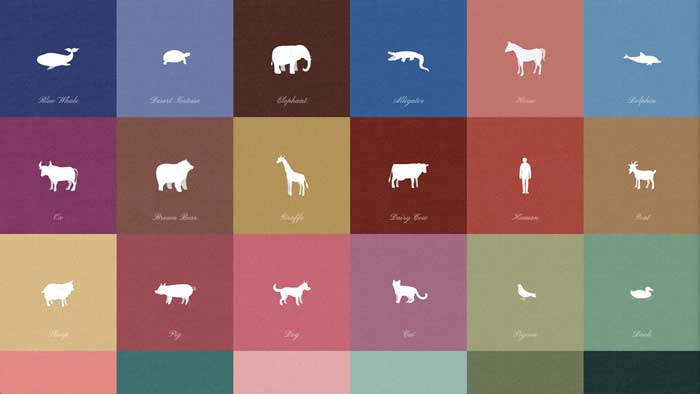
This piece was shortlisted in the Places, Spaces & Environment category.
Heartbeats. is an info-art piece to make the heartbeats of animals visible and audible. More than 150 species of animals are going extinct every day. Perhaps considering the beating, breathing lives of these animals will help us do what we can to slow this extinction. It is made with simple HTML + Javascript. The animation is made with Lottie, and the music is created with VCV rack.
1.82% // Information and Violence
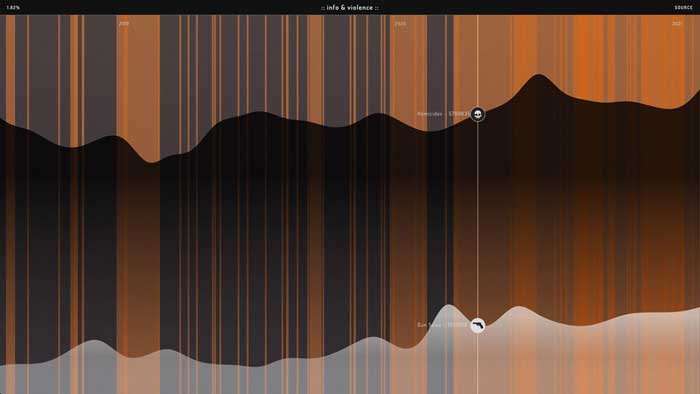
This piece was shortlisted in the Current Affairs & Politics category.
Information and Violence is an interactive data visualization showing a timeline of major U.S. news headlines along with gun sales and homicides from 2016. Since 2016, the number of gun sales and homicides has been steadily increasing. By showing them along top news at the time, it could show the possibility of the psychological influence of fear and anxiety in society.
PULSE of LOVE and HATE
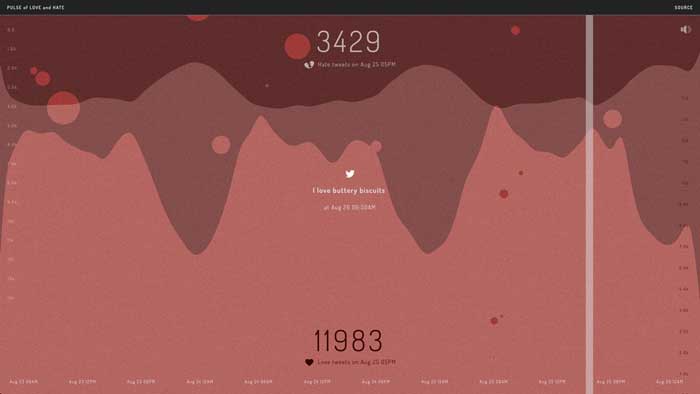
This piece was longlisted in the People, Language & Identity category.
Pulse of Love and Hate is an interactive and sonified data visualization of the hourly occurrence of the words 'Love' and 'Hate' on Twitter. Many users spend time reading various online news platforms and social media without knowing how biased, curated, or personalized the content is. This project started with a simple question 'Does the world actually feel the way it appears to me online?.. or are a series of algorithms behind my notion of the mood of the world?' This simple info-art lets us see the real number of one small aspect of people's emotional mood by their tweets. Come take a peek at how and what people 'Love' and 'Hate' at this very moment.
Perspective
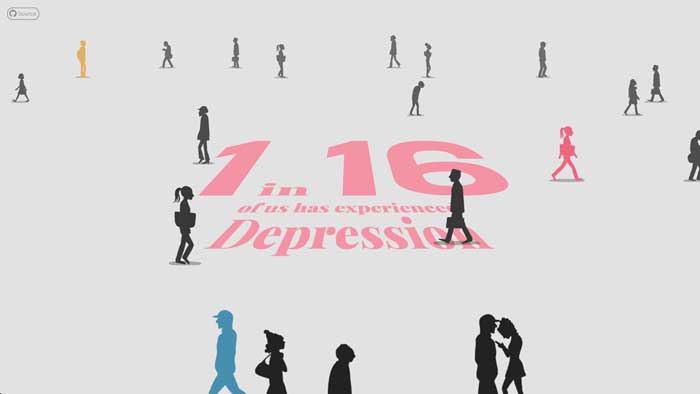
This piece was longlisted in the Science, Technology & Health category.
This generative animation Perspective shows how many people in Singapore have experienced mental health issues in their life. 20 silhouetted characters walk past the screen randomly, and the ratio of color reflecting the mental issue the person experiences is generated from the real world data. By clicking on the colorful walkers, a user can learn about their mental health issue.